Color schemes in interior design is the key element helps to create a living space in harmony, aesthetics, and bearing the stamp of the individual. By understanding the rules, color schemes, and apply them in a flexible way, you absolutely can “transform” the house becomes cozy, luxurious or young, depending on the wishes.

Why is color important in interior design?
Colors have the ability to impact strongly to emotions and human perception. In interior design, color schemes, not only helps to balance the visual but also the style for the entire space. A space using logical color will bring a pleasant feeling, increase the aesthetic appeal and maximum support for the use of each area in the house.
The influence of color to psychology
Each color gamut bring a nuanced and personal feelings. Blue helps to relax and create a sense of tranquility, while yellow back, bring energy and warmth. If you know the color scheme in interior design a scientific way, you can adjust the mood for each space: bedroom, calming, cozy living room, or office, the focus and creativity.
Role in shaping the style
Color is “language,” the first show design styles: modern, vintage, minimalist, or industrial. For example, the neutral tones such as white, grey, beige often appear in the nordic style, while bold shades, such as black, green coal remains popular in the modern style personality.
Principles that govern the basic colors in the interior
To color coordinate effectively in interior design, you should know a few basic rules below.

Color wheel and the rules color schemes
The color wheel is a visual tool to help you get to know the relationship between the colors. Based on the color wheel, which can apply the rules dithering follows:
- Color schemes monochromatic (Monochromatic): Use a color schemes with the color intensities differently, creating a harmonious and delicate.
- Color scheme similar (Analogous): Choose 2-3 colors near each other on the color wheel to bring the seamless, gently.
- Color schemes complementary (Complementary): Combination of two colors opposite each other, like blue – orange, red – green, creating strong contrast and striking.
- Color schemes triangle (Triadic): Pick three colors are evenly spaced on the color wheel (for example: red – yellow – blue) to create the balance vivid.
Rules 60-30-10
One of the common color is the rule 60-30-10:
- 60%: color schemes, covering the majority of the space (walls, floors, foundation).
- 30%: colors, create focal points for interior (curtains, sofa, cabinets).
- 10%: accent color used for the small ornament (pillows, paintings, lamps).
This rule helps you maintain balance and create depth to the space.

Suggestions colour schemes in each living space
Each space in the home bring different functions, so the options and color schemes also need to be flexible.
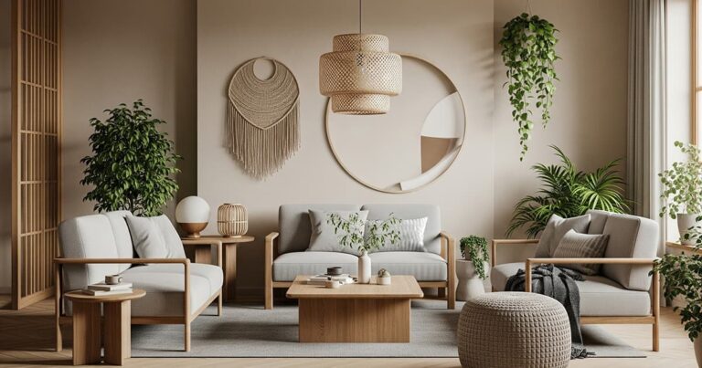
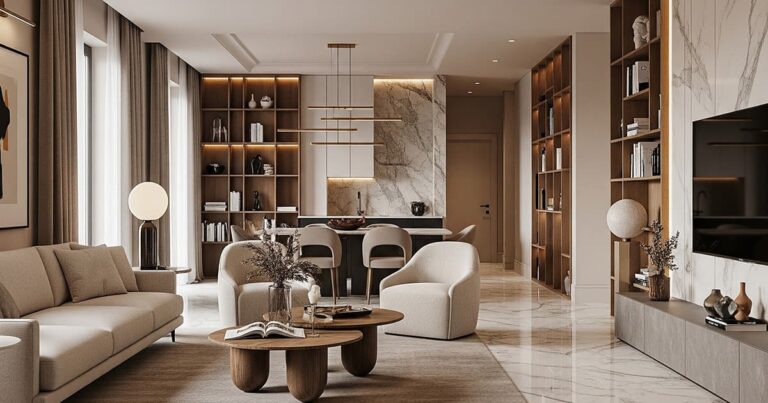
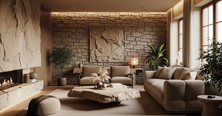
Living room: the Balance between comfortable and chic
The living room is where the living and the living, should be the priority pleasant colors, shown to be aesthetic. Can combine neutral colors (white, grey, beige) background, accented by the warm-toned (yellow, orange land) or metallic shades (gold, silver) to increase the luxury.
Bedroom: Priority relaxing feeling
This is a private space, so choose soothing colors such as light blue, pastel, white, cream to bring peace. Avoid using colors too hot or too bold because it is easy to cause feeling stuffy affect sleep.
The kitchen and dining room: Creating a cozy and stimulate the taste buds
Grams of warm colors such as yellow, brown wood, orange land is often used to increase the sensation of warmth and stimulates the appetite. White is also a popular choice because it is easy to match and create the clean.
Work: stimulate concentration
Should use blue, gray or white, to increase working performance. Avoid color too striking to cause distraction. Can combine green plants or fresh colors light to create highlights vivid.
The common errors after color schemes interior should avoid
Although gu good aesthetic but if you do not master the principles, the color scheme is still susceptible to error:
Using too many colors
A space to use too much color to cause disorder eye and lost harmony. The best should only choose a maximum of 3 primary colors in a space.
Lack of link colors between rooms
Each room should have your own style, but still need consistency in order to create a sense of continuity. Can use a common theme color throughout the house, then variations in each room.
Do not pay attention to light
Light directly affects the way the color shown in the space. A color can look very pretty under natural light, but becomes faint or false under artificial light. Therefore, the need to carefully consider when choosing paint colors or interior materials.
Conclusion
Understand color schemes in interior design not only help you to create a living space in harmony and beautiful to the eye but also is evident personality and aesthetic separately. Let's start from the basic rules, combining creativity and emotion to create a space ideal for the you and your family.
If you have the idea to redesign their living space, don't hesitate to refer to the trend color schemes new and experiment to find the perfect combination most. You can also contact the expert interior designers for advice deeper!